


Select this license type when you are developing an app for iOS, Android, or Windows Phone, and you will be embedding the font file in your mobile application's code.
Knockout®
by Hoefler & Co.
Licenses from $177.00 USD
Complete family of 32 fonts: $839.00 USD
Knockout Font Family was
designed by
Jonathan Hoefler and
published by
Hoefler & Co.. Knockout contains
67
styles and family package options.
Currently #33 in Best Sellers.
More about this family- Aa Glyphs
-
Best ValueFamily Packages
- Individual Styles
- Tech Specs
- Licensing
Basic typesetting
Letter case
Numerals and scientific typesetting
Typographic variants
Reset
-
Knockout No. 26 Junior Flyweight
-
Knockout No. 27 Junior Bantamweight
-
Knockout No. 28 Junior Featherweight
-
Knockout No. 29 Junior Lightweight
-
Knockout No. 30 Junior Welterweight
-
Knockout No. 31 Junior Middleweight
-
Knockout No. 32 Junior Cruiserweight
-
Knockout No. 33 Junior Heavyweight
-
Knockout No. 34 Junior Sumo
-
Knockout No. 46 Flyweight
Per Style:
$26.21 USD
Pack of 32 styles:
$839.00 USD
Knockout Series G Pack
5 fonts-
Knockout No. 90 Ultimate Welterweight
-
Knockout No. 91 Ultimate Middleweight
-
Knockout No. 92 Ultimate Cruiserweight
-
Knockout No. 93 Ultimate Heavyweight
-
Knockout No. 94 Ultimate Sumo
Per Style:
$35.40 USD
Pack of 5 styles:
$177.00 USD
Knockout Series F Pack
5 fonts-
Knockout No. 70 Full Welterweight
-
Knockout No. 71 Full Middleweight
-
Knockout No. 72 Full Cruiserweight
-
Knockout No. 73 Full Heavyweight
-
Knockout No. 74 Full Sumo
Per Style:
$35.40 USD
Pack of 5 styles:
$177.00 USD
Knockout Series E Pack
5 fonts-
Knockout No. 66 Full Flyweight
-
Knockout No. 67 Full Bantamweight
-
Knockout No. 68 Full Featherweight
-
Knockout No. 69 Full Lightweight
-
Per Style:
$35.40 USD
Pack of 5 styles:
$177.00 USD
Knockout Series D Pack
5 fonts-
Knockout No. 50 Welterweight
-
Knockout No. 51 Middleweight
-
Knockout No. 52 Cruiserweight
-
Knockout No. 53 Heavyweight
-
Knockout No. 54 Sumo
Per Style:
$35.40 USD
Pack of 5 styles:
$177.00 USD
Knockout Series C Pack
5 fonts-
-
Knockout No. 47 Bantamweight
-
Knockout No. 48 Featherweight
-
Knockout No. 49 Lightweight
-
Per Style:
$35.40 USD
Pack of 5 styles:
$177.00 USD
Knockout Series B Pack
5 fonts-
-
-
-
-
Per Style:
$35.40 USD
Pack of 5 styles:
$177.00 USD
Knockout Series A Pack
5 fonts-
-
-
-
-
Per Style:
$35.40 USD
Pack of 5 styles:
$177.00 USD
About Knockout Font Family
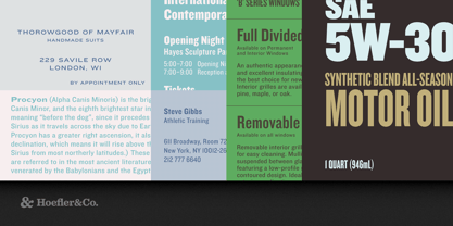
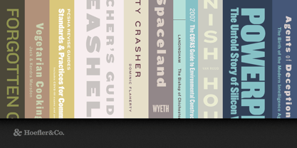
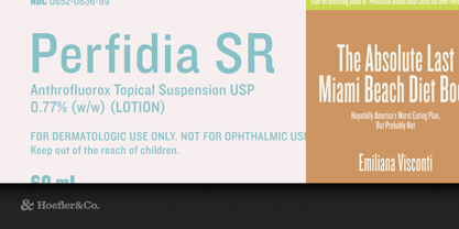
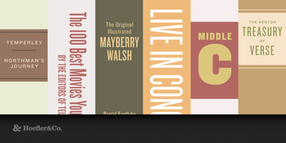
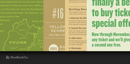
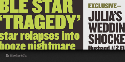
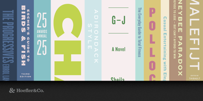
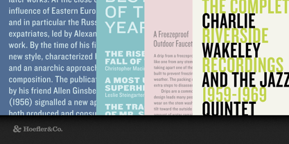
A sweeping collection of 32 sans serifs, Knockout restores some much-needed vitality to an overlooked corner of the typographic spectrum.
The Knockout typeface was designed by Jonathan Hoefler in 1994. A reimagining of Hoefler’s earlier Champion Gothic headline series (1991), Knockout is an interpretation of the motley sans serifs that supplied American job printers starting in the late nineteenth century. Its thirty-two styles reference both the tall, condensed wood types used for posters, and the miniature ‘engraver’s faces’ once used for stationery. A prominent effort in the preservation of American vernacular typography, Knockout first appeared in the pages of The New York Times Magazine in 1994.
From the desk of the designer:
The notion of the “type family” is so central to typography that it’s easy to forget how recent an invention it is. Throughout most of its history, typography simply evolved the forms that were the most useful and the most interesting, generally with indifference toward how they related to one another. Italic faces existed for decades before they were considered as companions for romans, just as poster types shouted in a range of emphatic tones before they were reimagined as “bold” or “condensed” cousins. The notion that a type family should be planned from the outset is a Modernist concoction, and it’s one that type designers have lived with for less than a century.
The organization of typefaces by weight and width may be one of Modernism’s great gifts to typography, but the expectation that fonts should cohere to some prefabricated schedule of styles is one of its greatest fallacies. Demanding that every typeface march to the drumbeat of roman, italic, bold, bold italic is an arbitrary imposition on a naturally diverse world; in other professions, this kind of universalist thinking gives us brutalist worker housing, or prairies planted with monocultures. Knockout defies the Modernist canon, in order to reclaim one of typography’s great natural wildernesses: the American sans serif.
For more than a century before Helvetica, the sans serif landscape was dominated by unrelated designs. Gothic woodtypes in a dazzling array of proportions lived comfortably alongside anonymous foundry types, each design’s integrity the product of its autonomy. Because none of these faces were intended to relate to one another, none of their design characteristics were beholden to any external constraints: what worked for a supercondensed boldface need only work for that design, not also for the extrawide light face whose design afforded different possibilities and faced different challenges. This sort of “situational” approach to type design allowed for more varied and interesting designs, and it’s this approach that Knockout celebrates. With the functional benefits of a family that’s well-organized, and the visual appeal of styles that are individually designed, Knockout’s nine-width, four-weight family offers a range of voices that’s impossible to achieve with even the best Modernist sans serifs.
|
Featured in: Best Fonts for Logos, Best Fonts for PowerPoints |
Designers: Jonathan Hoefler
Publisher: Hoefler & Co.
Foundry: Hoefler & Co.
Design Owner: Hoefler & Co.
MyFonts debut: Sep 28, 2021
Knockout®
is a registered trademark of The Hoefler Type Foundry, Inc.
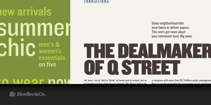
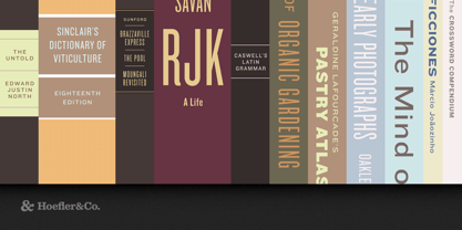
About Hoefler & Co.
Famous for designing long-lived typefaces marked by high performance and high style, Hoefler&Co creates the fonts that give voice to the world’s foremost institutions, publications, causes, and brands. With a library of 1,500 fonts designed for print, web, office, and mobile fonts, Hoefler&Co is everywhere. Their typefaces shaped the presidential campaigns of Barack Obama and Joe Biden; they’re on the cornerstone of One World Trade Center and on every iPhone ever made. They serve brands from Delta Air Lines to Tiffany & Co., publications from Harper’s Bazaar to The New York Times, institutions such as the Guggenheim Museum, The Public Theater, and New York University, and non-profit organizations including the Natural Resources Defense Council, the Southern Poverty Law Center, and The Peconic Land Trust. The Premium foundry page can be viewed Here.
Read more
Read less